The lack of features in the application makes it difficult for users to use the cinema ticket purchase application.
UI/UX Design
Mobviez Mobile App
Google UX Design Certification Project
Role
Product Designer
Year
2023
Overview
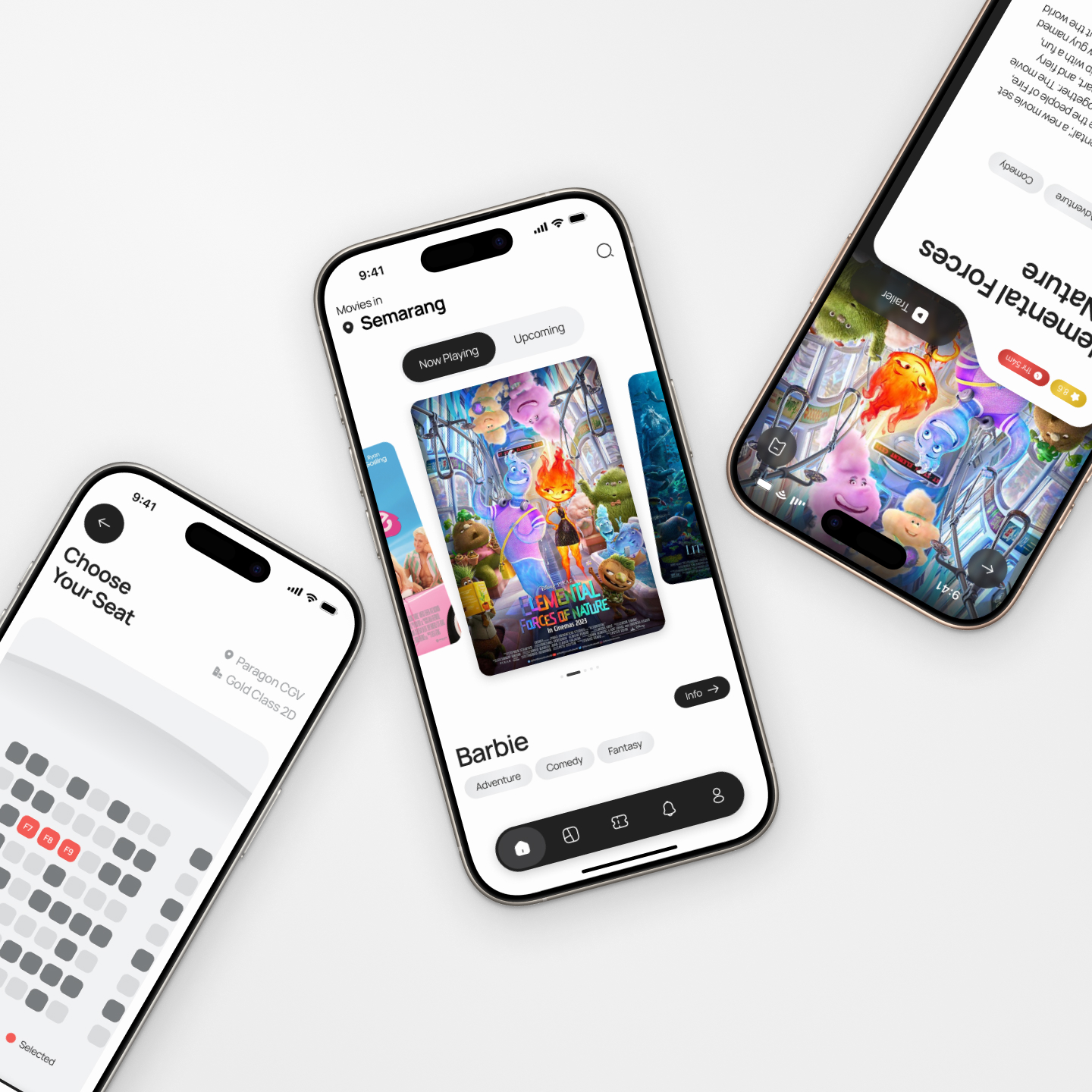
Mobviez (Mobile Movies) is a mobile-based application used to book cinema tickets easily and efficiently. With the tagline "Your ticket to the big screen, anytime, anywhere", Mobviez has committed to help people from all ages to have quality time with family and friends conveniently.
User Research
Here I conducted interviews with users who have seen the film before, live in Indonesia, aged 18 to 60 years old, who are evenly divided into several gender spectrums and community groups. Based on the results of the interviews, most of them stated that similar applications have a very poor UI. Not only that, but some similar applications also do not cover all user interests, such as very limited payment types, not being able to purchase cinema food and drinks through the application, and very minimal cinema information.
Pain Points
1
2
The inability to buy snacks through the app causes a long queue to buy snacks and makes users have to come early to avoid missing the story.
3
Some similar apps do not display the geolocation of the theatres causing users to be confused as to the location.
4
Some similar apps do not provide an engaging browsing experience as too many adverts pop up.
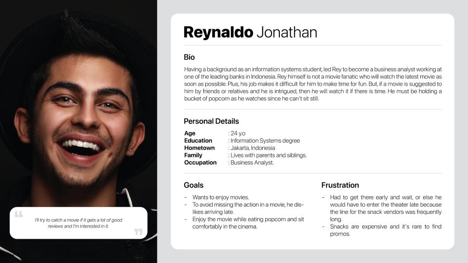
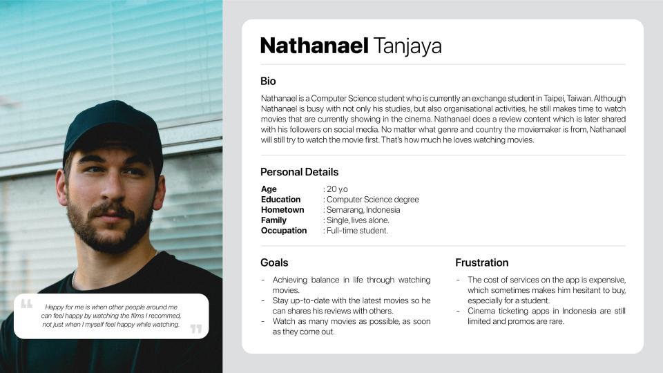
Personas
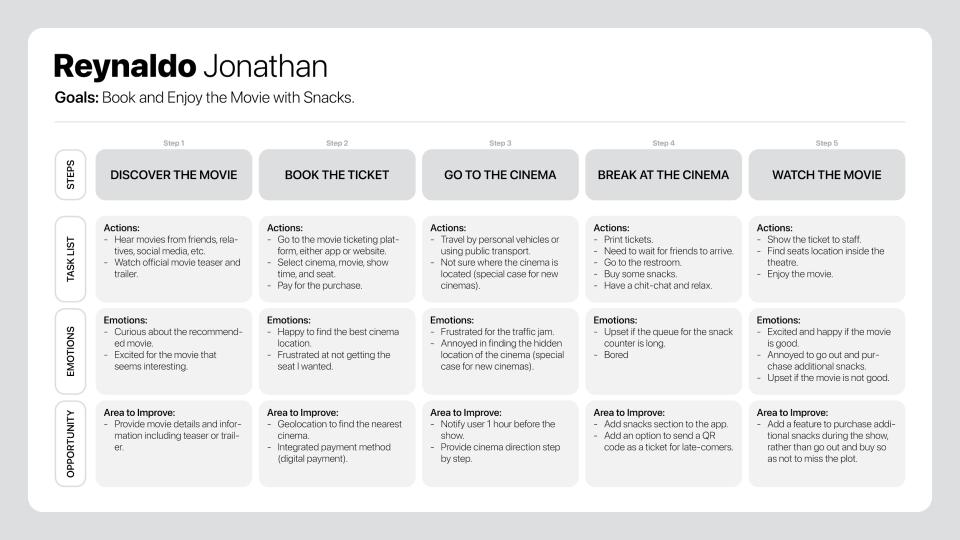
Journey Map
Wireframe
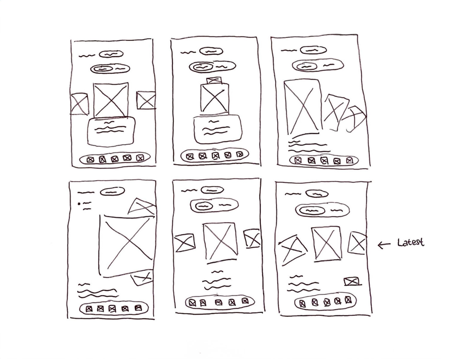
In the process of working on wireframes, I first sketched on paper to get ideas and a big picture of the design to be created. Here, I took an example of one of the pages and I created 6 alternative designs.
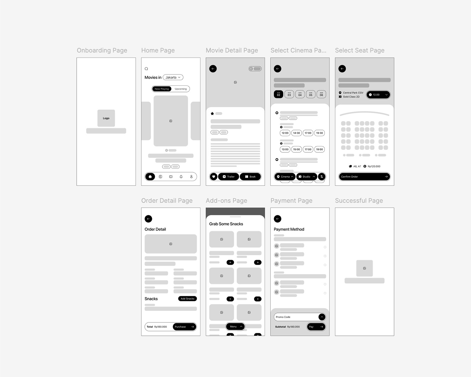
After the paper wireframe is done, I start converting the concept into a digital wireframe using the Figma application.
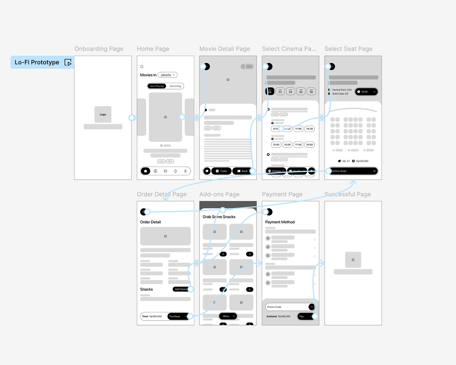
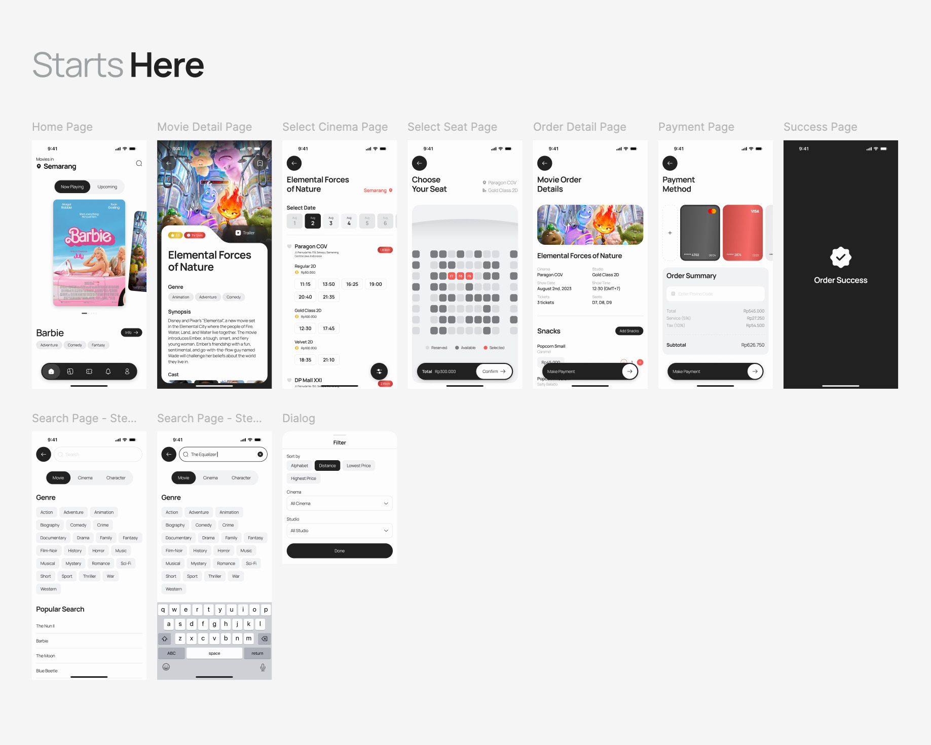
Next, I added details by providing a low-fidelity prototype for the primary flow of booking movie tickets.
Design
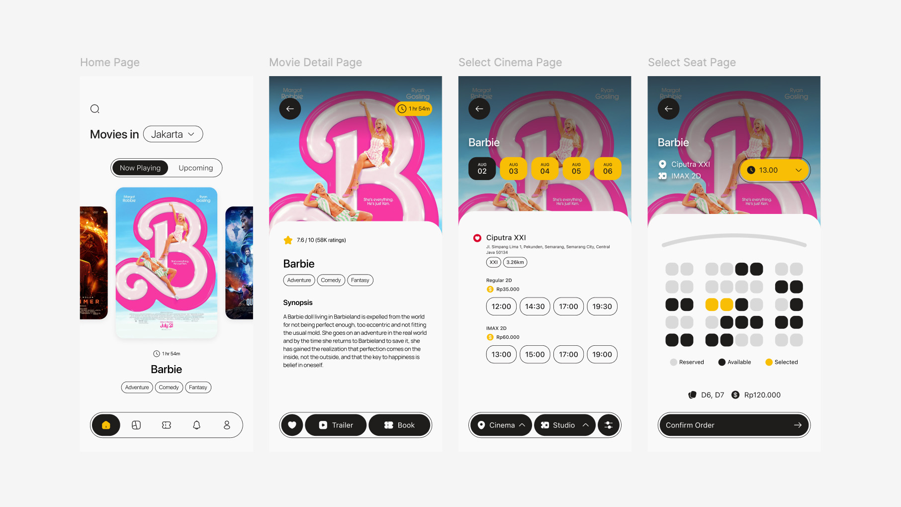
My initial design concept is presented in the image above. However, in pursuit of continuous improvement, I refined the design to achieve the second iteration, shown below.
Prototype
Design System
Before actually executing the design process of Mobviez, I tried to create a simple design system as a guideline in achieving consistency in the use of color, size, typography in each element.

The most basic part of design system is the grid. Here, I created a mobile-size grid because this case study is for a mobile-based application. After that, I started defining the colors that will be used in this application.
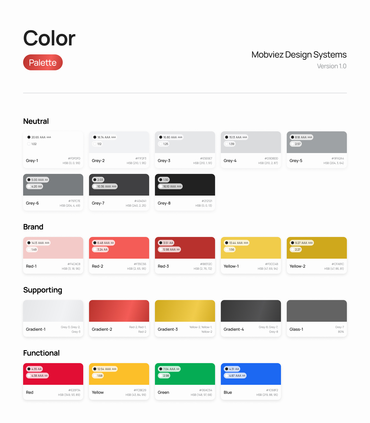
I categorized the use of colors into 4 groups: Neutral which contains shades of grey starting from white to black, Brand which contains the branding colors of Mobviez, Supporting which contains gradient colors as support, and Functional which contains 4 basic colors for warning, info, alert, and success. For each color there is WCAG information when used on light and dark backgrounds.
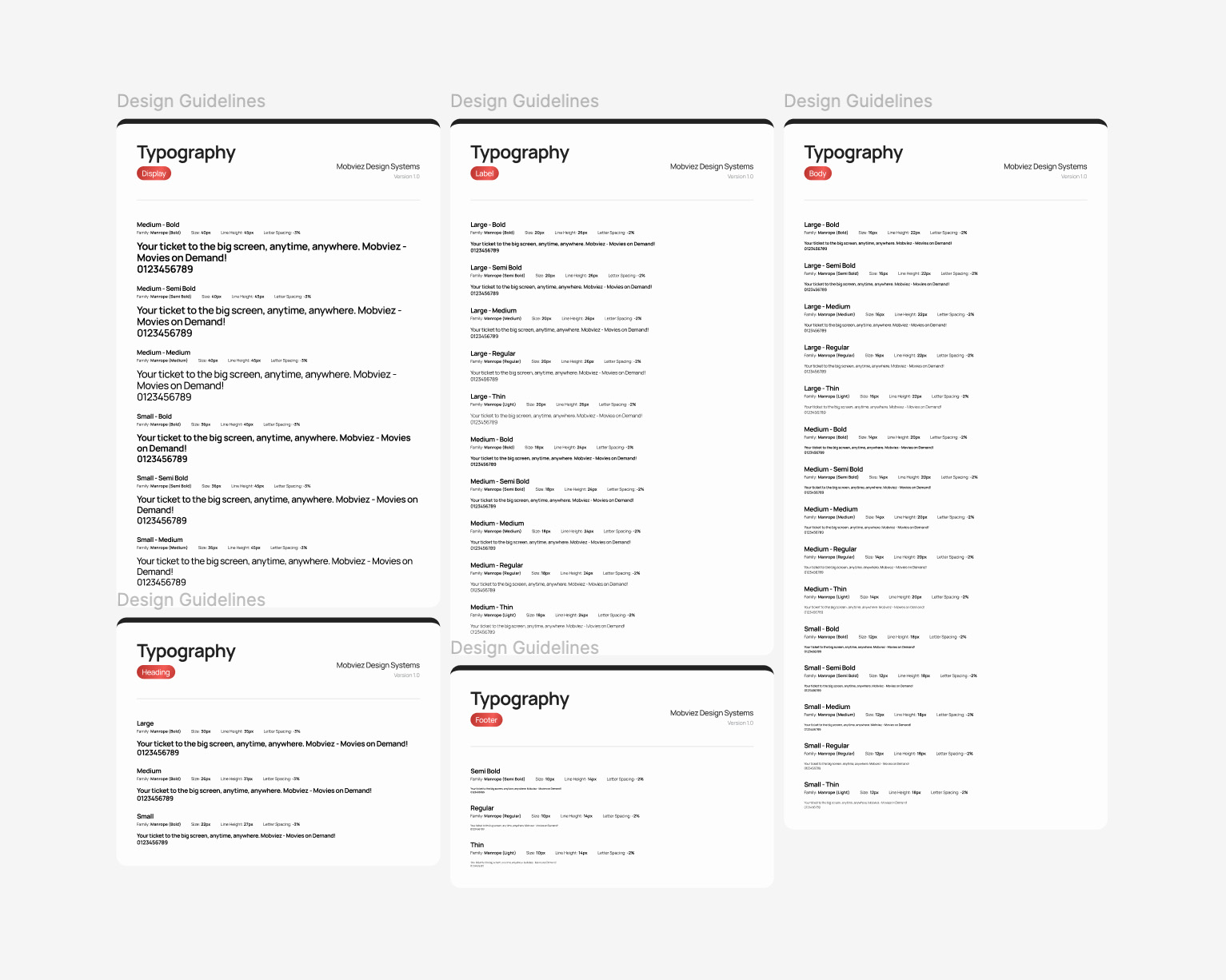
Furthermore, I defined the use of typography into 5 groups: Display, Heading, Label, Body, and Footer. The Mobviez project uses the Manrope font-family which can be obtained as open source from Google Fonts.
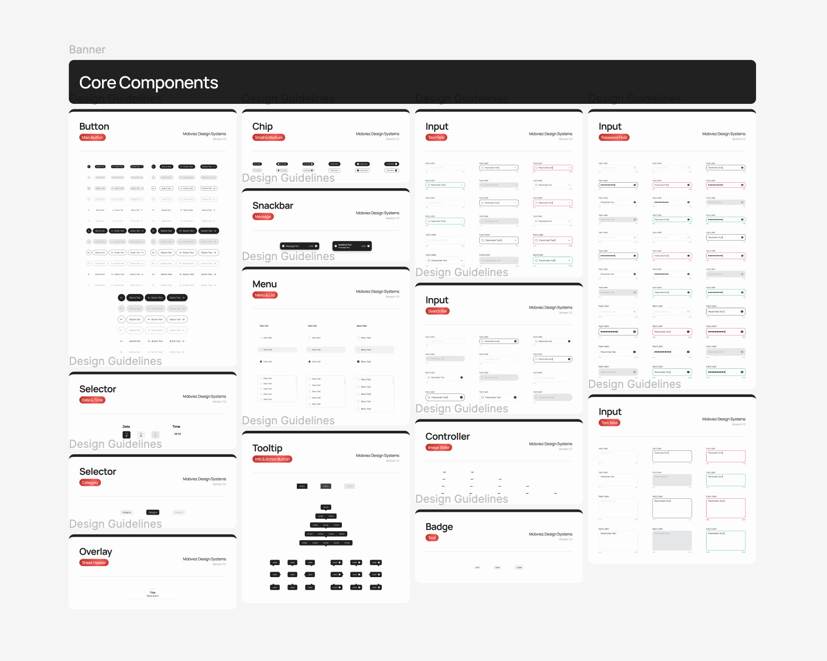
The last part of this design system is to define elements that will be used repeatedly on several pages.
Going Forward
Takeaways
This experience has underscored the critical value of research and usability testing in developing effective solutions. By incorporating these practices, we can ensure our solutions are truly user-centered and meet the specific needs of our target audience.
Next Steps
1
Conduct deeper research to find out more about user needs and improvise opportunities.
2
Conduct usability studies with more and diverse users to ensure that each pain point has been resolved properly.
3
Standardise the design to keep the UI consistent and attractive to increase user satisfaction.